About Logos
Autumn 2001
In this note I’ll try to apply to logo design the laws of form and colour perception borrowed from psychology. Let me say right away: designing a logo by some technical algorithm is a dead end, because every element or symbol in a logo should hide far more than we are able to put into words. A symbol can be compared to a pyramid in which the conscious occupies only the very tip, while the whole massive rest of it is the unconscious. So while designing, it’s better to forget about rational techniques altogether for a while and rely on intuition. The information below will help you justify the form you’ve chosen and understand the meaning of the elements you’ve come up with, rather than serve as a step-by-step guide to designing a logo.
First, a few important remarks about logos
1. A logo cannot be good or bad in itself. It can only be judged in relation to the company it represents and the ideas it expresses.
2. With every new detail in a logo’s drawing, with every step in bringing out its form, we don’t add meaning — on the contrary, we take it away, moving from the more all-embracing to the narrower. I’ve tried to show what I mean in the drawings below. The most all-embracing symbol is the dot. It can stand for any figure or object and can mean anything up to the entire universe. That is, a dot can be understood as a small rectangle, a rhombus or a cross; a dot can mark a house, a city, a planet, or a word, a phrase, a phenomenon — anything at all. If we stretch it into a line or enlarge it into a circle, we automatically subtract countless forms and meanings from its symbolism: the dot can no longer be a square, a rhombus, a triangle and so on. Stretch the circle into an oval and we lose yet another set of meanings. An oval can no longer be a circus ring, a planet and so on. Dot, dot, comma, dash — and there’s a crooked little face. A convex arc of a smile automatically removes all the sad faces from the symbol’s meanings. By showing some detail in a symbol, on the one hand we single out a particular meaning, and on the other we cut away from it a far greater number of meanings that don’t match that detail. A bow on the little face cuts men, grannies and serious ladies out of the symbol’s meanings. A hat takes away women, little boys and girls, alternative youth and so on. And in the last drawing the detail no longer lets us see an arbitrary person in the symbol at all: the little face turns into a quite specific face that resembles some acquaintance, Bob or Pete. I noticed this when I was drawing caricatures. To my surprise, I found that caricatures with carefully and painstakingly drawn and coloured figures make people smile far less often than ones drawn with the simplest lines. When the faces in caricatures take on too specific a form, it becomes much harder for a person to put their own feelings into them, to see in them their friends and the people around them.


3. And the third point I’d like to make: in most cases a logo’s mission is actually more introverted than outward-facing. It is meant to unite the thoughts and aspirations of the company’s own employees. A logo works much like a tattoo. Other people pay it many times less attention than its owner does. Every time a person looks at, say, the image of a wolf on their shoulder, they remind themselves of the way of life they’ve chosen, as if drawing extra will and inspiration from it to keep sticking to their line of conduct.
And now, about what logos mean
Let’s start with dynamics. Looking at a logo, we can mentally trace its movement — that is, imagine what would happen to it if it turned out to be a frame from a film. So a logo directed to the right means an orientation towards the future, and to the left, towards the past. This holds true at least for countries where people write from left to right. Logos that seem to look straight at us (symmetrical ones) indicate, on the one hand, a company’s egocentricity, a wish to be guided by its own principles and to create its own rules and norms, and on the other, a focus on the present. Slanted and diagonal lines speak of radicalism, while vertical and horizontal ones speak of conservatism. Wavy lines indicate flexibility and a creative approach.
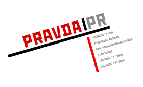
| Here is an example: the logo of the newspaper “PRAVDA” (the Soviet Communist Party daily): It is directed to the left, which speaks of an orientation towards the past — and that matches its content. |
 |
 |
And this is the logo of “Nike”. The swoosh sends the lettering moving to the right and upwards. This orientation towards the future is also clearly visible in the company’s commercials. Sport combined with new technology — that’s their main idea. |
| Egocentricity is not necessarily a negative trait for a company. Take “Adobe”, for example. Anyone who has worked with its software — Photoshop, PageMaker, Illustrator — may have noticed in it, on the one hand, self-sufficiency, and on the other, a certain insularity, an unwillingness to adapt to others (which is typical of, say, Corel or Microsoft products). |
 |
Many image-driven market leaders also have an “egocentric” logo:
The slant of lines.
Canted and diagonal lines, as I’ve said, speak of radicalism, while vertical and horizontal ones speak of conservatism. We find the most vivid embodiment of the horizontal and the vertical in the Christian cross — the symbol of the most conservative organisation in the world. And one of the most radical was the German Nazi party with its swastika — a combination of diagonal lines.
 |
The Christian cross — the symbol of the most conservative organisation in the world. |
| The swastika — diagonal lines speak of radicalism | 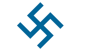 |
|
 |
“Marlboro” — the vertical lines express conservatism: the image of a cowboy who has no wish to adapt to the times. |
| “Harley-Davidson” — this style is just as immune to fashion as “Marlboro”. The vertical lines are clearly visible here too. | |
 |
“Parker” is also known for its conservatism. |
| Communist views have now become radical, which shows in the lettering being turned diagonally. | |
One special case of diagonal lines is italic type. It often signifies not so much radicalism as dynamism or speed. That is, a company that is itself conservative may be engaged in an activity connected with speed, with the new times.
| “Kodak” is not especially radical, yet it wants to show speed of service, as you can see from its logo: the word “Kodak” has stayed upright, while “express” has been set in italics | 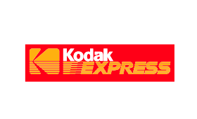 |
 |
In its advertising campaign, “Stimorol” constantly tries to create an association with the new generation and with speed (motorbikes, cars). |
| “GILLETTE”, with its slogan of a “high-speed shave”, often uses speed associations in its ads: a fighter jet, cars. |  |
Line thickness.
Bold lines in a logo indicate that the company’s product is something concrete that can be measured precisely, that you can “touch”. Thin lines, on the other hand, are often found in the logos of companies working in design, fashion, art or other irrational activities whose value is hard to pin down. Such work is often called just that — “refined”.
 |
A car’s specifications can, as a rule, be measured precisely: engine displacement, maximum acceleration and so on. |
And here are the logos of companies connected with the fashion industry:
Shapes: Circle. Square. Zigzag.
Circles express an emotional orientation, a longing for relationships with other people, love, kindness, love of nature, warmth of heart.
| The circle expresses warmth of heart — perhaps because it resembles a face? |  |
 |
The “Beseda” tea brand (the name means “a chat” or “conversation”) is drawn in a semicircular form. The name itself confirms the interpersonal orientation, and the TV ads also emphasise warmth. |
| “Lucky Strike” — the advertising image of “good old friends” and unity with nature. |  |
Drawn with “circular” lines, a logo can express the same meaning. Their sweep and curling elements speak of creativity and versatility. A calligraphic typeface with flourishes, as in old manuscripts, expresses these qualities vividly. (I’d like to point out an interesting phenomenon connected with the words that describe feelings and psychological traits. They speak for themselves: versatility — the logo is drawn in many directions; refinement — the logo has fine lines; firmness (a firm character) — the logo has clear, bold lines; stability — the logo is shaped like a stable figure that widens towards its base.)
| “Doka Khleb” (a bakery brand) — the rounded elements create a feeling of warmth. |  |
Zigzag-shaped logos signify originality, an unconventional approach to solving problems, independence from stereotypes and from any rules and dogmas. The other side of these same qualities is a lack of focus, chaos, the absence of a central backbone.
 |
The Internet — the sphere with the fewest restrictions and dogmas. |
| Companies that promote a style of independence and free-and-easy behaviour | 
|
 |
About colours
Blue and its shades.
Watching the sky, the sea and water every day from early childhood, we form a firm association of blue with freedom, boundlessness, lightness and depth. In nature, blue is usually bodiless, which is why it is linked with human thought, the spirit, the virtual. In logos it is used by research companies and by companies connected with computers. Having no body, blue also has no egocentricity — it is selfless.
Blue is incompatible with any inequality or pressure. In nature, the blue elements (water, air) can blow away, wash away, carry off or swallow up, but never squeeze or restrict freedom. The freedom of blue gives a feeling of calm.
Dark blue stands out for its formality and severity. Its rationalism deprives emotions of their source, though it doesn’t contradict them.
The warmer blue becomes (the closer it gets to sky blue), the more emotional colouring it has. Sky blue offers a protection from space (the cosmos, the ocean abyss) that blue doesn’t have. It brings complete relaxation.
By almost everyone, yellow is associated with the sun. It signifies joy and emotions. Being the “weakest” of all colours (it easily gets lost when mixed with others), it is perceived as very superficial and shallow.
The pure green we’re used to seeing in plants, which are static by nature: however much the wind shakes them, however far they spread outwards and upwards, their roots still keep them chained to the ground. That is why green expresses stasis, or a “static” self-admiration, and at the same time the struggle for a place in the sun. Its presence in a logo may indicate that a company is persistent and moves along a well-trodden path with slow but sure steps, without resorting to unconventional experiments. That said, in ninety per cent of cases it is used as a symbol of nature and plants.
Green as a whole expresses one’s attitude towards oneself. And from the shade mixed into the green you can judge how a company sees itself, how it wants to look, and therefore what demands it makes of itself. Blue-green speaks of high spiritual ideals and strict moral demands (above all on oneself).
Bright blue-green is very often used by companies connected with cold and coolness; it also expresses sterility and cleanliness.
Yellow mixed into green makes it more relaxed and more emotional. The self-admiration is still there, but now it looks more naive, as if saying: “Look how sweet and pretty I am.” It also signifies infantilism and growth, and in general symbolises the beginning of something (buds opening on the trees have this colour). It is often used by children’s organisations.
Combined with brown, green signifies attachment to the body, to bodily pleasures, to the earth. The self-admiration of green shows up here as “the value of one’s own physicality”. You often see it with companies that trade on human vices: expensive cigars, wines, cognacs. Its light shades have for some reason come to be widely used to depict gold on paper. This is an interesting phenomenon. Everyone who sees this colour recognises it as golden, although in reality there is no green in gold at all. Perhaps this has to do with the use of bronze paint, or perhaps it comes from a psychological match between the meaning of this colour and that of gold.
C ound up with red is everything in a person’s state of mind that raises blood pressure and quickens breathing and the heartbeat. All these symptoms come with a “red mist before the eyes”. It is sex, and anger, and irritation, and excitement, and euphoria, and unrestrained joy, and love. In a word — activity.
Dark shades of red, the colour of “clotted blood”, on the contrary, express rest, cosiness, the “warmth of a tavern”. All the qualities listed for red are expressed in dark red, like blood, in a congealed, thickened state. You could link it with, so to speak, “hot relaxation”. It is used when you want to attract gourmets and lovers of restaurants and saunas. It expresses fullness and substance. Its presence in a logo says that you can expect concrete results from the company — results you can “touch with your hands” and “feel here and now”.
If darkening red means fullness and substance, then lightening it to pink, on the contrary, empties it and makes it commit to nothing. Pink is an excitement that rests on nothing and leads nowhere. That is why this colour is considered childish, frivolous, a symbol of fantasy. It is often used by perfume and cosmetics companies.
Orange — yellow mixed into red makes the activity of red aimless, scattered in space. The effect of orange is shown very clearly in the “Fanta” commercials. They show young people who often go to enormous lengths just “for a laugh”: stopping a plane, carrying a sofa onto the beach, putting a snow cannon on a roof to make it snow “Fanta snowballs”.
Compared with orange, brown (dark orange) doesn’t have as much turbulent energy. On the contrary, it signifies calm, monotonous activity, a connection with the earth. In logos it is usually used only to indicate the company’s line of business — wood, furniture, cognac.
Violet, lilac and purple stand out because they hardly ever occur in nature, except perhaps in a purple sunset. They are used when you want to show the fantastical nature of a landscape in film and painting. They express everything distant and mysterious — dreams, fantasy, esoterica, unreality, and also the future. They often express infantilism and immaturity.
Black, white and grey speak of emotional closedness. When the whole logo is black and white, it may look like a technical necessity, and its colour meaning loses its force. It gains that force when one of the elements is coloured and the rest are not, and it becomes obvious that the choice of these colours was deliberate rather than forced. Black and white speak of adherence to principle, of extremes. Black is active inertia; white is passivity, escape (it easily gets lost when mixed with other colours). White and light grey can be seen as openness to outside influence — a blank sheet that can be painted any colour.